The principles of presenting statistical results using figures
Article information

Abstract
Tables and figures are commonly adopted methods for presenting specific data or statistical analysis results. Figures can be used to display characteristics and distributions of data, allowing for intuitive understanding through visualization and thus making it easier to interpret the statistical results. To maximize the positive aspects of figure presentation and increase the accuracy of the content, in this article, the authors will describe how to choose an appropriate figure type and the necessary components to include. Additionally, this article includes examples of figures that are commonly used in research and their essential components using virtual data.
Introduction
All studies based on scientific approaches in anesthesia and pain medicine must involve an analysis of data to support a theory. After establishing a hypothesis and determining the research subjects, the researcher organizes the data obtained into specific categories. In most cases, data are composed of numbers or letters, but can also be stored as photos or figures, depending on the type of research. After researchers classify and index the data, they must decide which statistical analysis method to use. In general, data composed of numbers or letters are stored in tables with rows and columns. This can easily be accomplished using spreadsheet-based computer programs. The simple functions provided by spreadsheet programs, such as classification and sorting, facilitate the interpretation of the essential characteristics of the data, such as structure and frequency. In addition, some spreadsheet programs can show the results of these simple functions as graphs (such as dots, straight lines, or bars) such that the structure and characteristics of the data can be grasped quickly through visualization.
Graphs can be used to present the statistical analysis results in such a way as to make them intuitively easy to understand. For many research papers, the statistical results are illustrated using graphs to support their theory and to enable visual comparisons with other study results. Even though presenting data and statistical results using visual graphs have many advantages, representative values of variables are not presented as exact numbers. Therefore, it is essential to follow some basic principles that allow for graphical representations to be both transparent and precise so information is not misinterpreted. A previous Statistical Round article has covered the general principles of presenting statistical results as text, tables, and figures [1]. The current article provides further examples of how to present basic statistical results as graphs and essential aspects to consider to prevent distorted interpretations.
Common considerations
In this section, general considerations for presenting graphs are described. Although not all aspects are essential, we have summarized the key points to improve accuracy and minimize errors when using graphs for information transfer and interpretation.
Axes
When data are expressed using dots, lines, diagrams, etc., the axes of the graph should have ticks on a scale sufficient to identify the value corresponding to the position of each mark. Both major ticks and minor ticks can be used to indicate the scale on an axis; however, a corresponding value should at least be presented as a major tick. The axis title should include the name of the measurement variable or result and the unit of measurement. If the scale of the axis is an arithmetic distribution, the interval between the marks should be displayed uniformly. When the value of a variable is transformed during analysis or if the measured value has already been transformed, the interval between the marks should be adjusted according to the characteristics of the data. In this case, the type of transformation or measurement scale used should be included in the graph legend (Fig. 1).
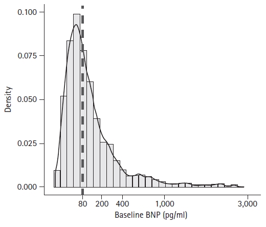
Histogram and accompanying density plot of baseline BNP. The baseline BNP shows a right-skewed distribution. The X-axis scale is logarithmic, and an explanation regarding the x-axis scale should be included in the footnote. Note the difference between the most frequently observed value and the representative value (dashed line). BNP: B-type natriuretic peptide, hsTnI: high-sensitivity troponin I, POD: postoperative day. From the previously-published article: "Moon YJ, Kwon HM, Jung KW, et al. Preoperative high-sensitivity troponin I and B-type natriuretic peptide, alone and in combination, for risk stratification of mortality after liver transplantation. Korean J Anesthesiol 2021; 74: 242-53."
If a part of the axis is removed, it is recommended that a break be inserted into the axis and the scales before and after the break be the same (Fig. 2). If the numbering of an axis has to start from a non-zero value, or if the scales before and after the break must be different, an explanation should be included.

An example of a line and dot plot. Note that there is a break on the y-axis, which is inserted to reduce the white space. The measured value at each time point is on those at the adjacent time points. The interpolated line between dots (markers) indicates their changing trend. The statistical method used was the two-way mixed ANOVA with one within- and one between-factor, and post-hoc Bonferroni adjusted pairwise comparisons. There was statistical intergroup difference (F[1,112] = 6.542, P = 0.012) and a significant interaction between group and time (F[3, 336.4] = 3.535, P = 0.015). *P < 0.05 between groups, †P < 0.05 between groups at each time point.
Each axis should have an appropriate range to distinguish between the data presented in the graph. In the case that the range is too large or too small for the displayed data values, the visual comparison of the data may appear exaggerated or the difference may not be recognizable.
Two-dimensional graphs with orthogonally oriented horizontal and vertical axes (x-axis and y-axis, respectively) that cross at a reference point of zero are most commonly used. However, an additional vertical axis can be included on the opposite side of the existing vertical axis if necessary to represent two variables with different measurement units in a single diagram.1)
Representative values
The preferred type of graph should be chosen based on the representative value of the data (absolute value, fraction, average, median, etc.). Choosing the most-commonly used graph type for a specific representative value helps the reader to interpret the data or statistical results accurately. However, in the case that the use of an uncommon type of graph is unavoidable, an explanation of the representative value and error term must be provided to prevent misunderstanding.
Symbols, lines, and diagrams for representative values
When a symbol, line, or diagram is used to indicate the representative value of the data, the size or thickness of the line should be adjusted appropriately. Additionally, the degree of adjustment should be uniform so that different sizes or thicknesses are not misunderstood as large or small values. In addition, the size and thickness should be adjusted to indicate real values. When symbols or lines are expressed in overlapping or very close proximity, they must have an appropriate size and thickness to allow for an accurate comparison of the values (Fig. 2). A statistical program or other types of program that draws a professional graph rather than a picture-editing tool should be used to accurately represent the positions of symbols, lines, and diagrams with the corresponding values. The graph tools provided by most statistical programs offer user-selected symbols and lines that can be accurately marked according to the corresponding values.
It is recommended that the same symbols be used every time a representative value is represented. However, to distinguish between different groups, different symbols can be used to improve discrimination. The use of different symbols to present the representative values of the same group is not recommended.
A line can be used either when every point represents a specific value or when it visually indicates a change between two symbols (Fig. 3). In the latter case, adding lines between symbols can make the interpretation difficult if the change is not meaningful. Different lines should be used for different groups or situations (Fig. 2). Sometimes, it may be difficult to distinguish between different dashes owing to the line thickness, the size of the graph, or overlapping lines. Therefore, different line types should be adjusted to allow for easy discernability. One option may be to use a color graph; however, this is recommended only when it is impossible to express the information accurately in black and white. Because some readers may have difficulty distinguishing colors, care must be taken regarding color selection.
An example of a dot-line graph. Dots and error bars indicate the means and SDs. The interpolated line allows for enhanced estimation of the changing trend. Bar plots could also be used to represent this kind of statistical result.
The representative value can also be presented using a shape. If the area or form of the shape is proportional to the value, an explanation of this fact should be included. For a diagram expressed at regular intervals where the height or length corresponds to the value (such as a histogram), precautions similar to those regarding symbols or lines should be applied.
Various colors or specific patterns can be used inside the diagram to facilitate interpretation. It is good practice to set different colors or patterns for each group or to use them differently to allow for data before and after an event to be distinguishable. However, such a graph may become complicated as a result of too many colors and patterns or a lack of unified notation.
Legend
A description of the variable or situation, represented by lines, symbols, or shapes, should be included in the graph legend. The legend can be located inside or outside the graph, as long as it does not interfere with interpretation. Explanations of values that the symbols, lines, and/or diagrams represent should be included. If abbreviations are used, their definitions should be included in the figure legend. Borders of the legend box can be added as needed around the legend to make it easier to read, and it may be helpful to match the order of data as it appears in both the legend and the graph.
Errors
Statistically inferred representative values and their corresponding errors can be indicated on the graph in various ways. Most commonly, whisker-shaped symbols are used to express errors. Depending on the type of graph, it is typically expressed by the length of a line or an area. When there are many representative values or considerable overlap, the symbols used to express the error will also overlap, making it difficult to distinguish between them. If the spread of data is equal on both sides, such as with a normal distribution, it can be presented in only one direction; however, both errors should be presented when the data are skewed to one side. Alternatively, to avoid overlap, the positions of the corresponding values may be moved forward or backward slightly; however, an explanation of this should be included in the figure legend. For example, if it is difficult to distinguish between the means and standard deviations of blood pressure measured at 5 sec after medication in two groups, the representative values of each group can be displayed at 4.9, and 5.1 sec. It is recommended to describe an explanation that the blood pressure values of the two groups measured at specific time point are displayed separately in the figure legend (Fig. 2). For representative examples, refer to the previous Statistical Round article [1].
Annotation
Annotations can be added to the graph to explain specific values or statistically significant differences. Annotations are also used to highlight visible differences in the graphs (in which case, instead of an annotation, an explanation should be included in the figure legend). Symbols can be used for annotations that explain statistical differences and should be consistent in type and order throughout the paper. As specified in the instructions to the authors for the Korean Journal of Anesthesiology, it usually follows the order: * (asterisk), † (dagger), ‡ (double dagger, diesis), § (silcrow), and ¶ (pilcrow) [2,3].
Figure legend
In order for readers to know what is contained in a figure and the results of any statistical analysis conducted, a figure legend should be included. A figure legend usually consists of a graph title, a brief description of the graph content, statistical methods, and results. Definitions of any abbreviations and/or symbols used should also be included to facilitate interpretation.
Commonly used graphs
Scatter plots
A scatter plot shows the associations between two numerical variables measured from one subject (Fig. 4). By adding another variable, three-dimensional expression is also possible. Scatter plots can also be used for ordered categorical variables, at the expense of reduced readability. A scatter plot displays the coordinates of the measured values on an orthogonal plane with two variables as axes using specific symbols, such as dots. The two variables may be independent of each other or may have a cause-effect relationship. Scatter plots are primarily used in the data exploration stage to examine the relationship between two variables, and a trend line2) can be added to indicate a statistically significant relationship between the two variables. Scatter plots help the reader to understand the relationship between two variables and contribute considerably to the visual expression and understanding of correlation or regression analyses.
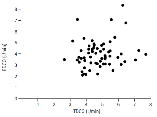
An example of a scatter plot. This plot presents the cardiac output value for the same patients using two different measurement methods: EDCO (esophageal doppler cardiac output) and TDCO (continuous thermodilution method). From the previously-published article: “Shim YH, Oh YJ, Nam SB, et. al. Cardiac output estimations by esophageal Doppler cannot replace estimations by the thermodilution method in off-pump coronary artery bypass surgery patients. Korean J Anesthesiol 2003; 45: 456–61.”
As described above, a scatter plot usually demonstrates the relationship between the actual values between two variables. In addition, however, a scatter plot is used for interpretation in some statistical methods. One example is the Bland-Altman scatter plot, which is a method used to analyze the agreement between two measurements (Fig. 5). In addition, scatter plots are often used to evaluate residuals in regression analyses or visually check the fit of a statistically estimated model.
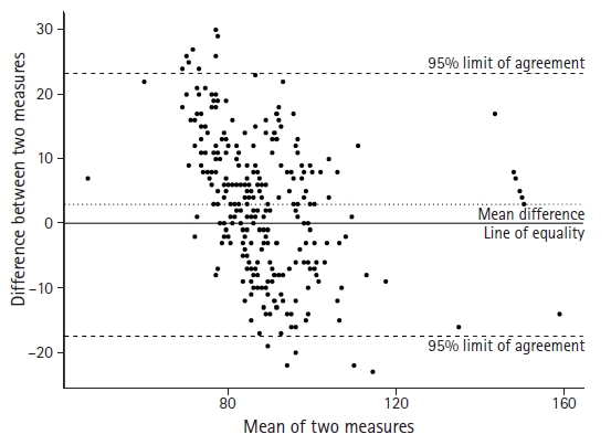
Bland-Altman scatter plot comparing the standard frontal position with an alternative mandibular position. The dotted horizontal line represents the mean difference between the two measures. The dashed horizontal lines represent the 95% limit of agreement between the two measures. The 95% limit of agreement is drawn at the mean difference +/- 1.96 times the standard deviation of the difference. The solid line is the line of equality which indicates the exact same value between two measures.
Line plot
A line plot is a graph that connects a series of repeatedly measured data points using a straight or curved line, based on a scatter plot. This type of graph is used in several fields to represent various statistical results. A commonly used example is any case in which the data are measured at a set time interval. A run chart (run-sequential plot) is a line plot that displays the data in chronological order. When applying a continuous variable on one axis, such as time, caution must be taken regarding the scale interval. Ordered categorical variables are also candidates for line plots. With scatter plots, measured values are mainly used to examine the data distribution; however, line plots are used primarily for averages, which are representative values of the measured data under specific conditions in the relevant group. As previously mentioned, the errors (such as the standard deviation) must be displayed on a line plot with the representative values.
Bar chart
For bar charts, the height or length of each bar represents the value of the variables, and the ratio between them makes it easy to visualize the differences between categorical variables. On either the horizontal or vertical axis, the values are presented as scale values, whereas on the other axis, the values are presented by other measurement parameters. This type of graph can also be used to express continuous variables, and it is possible to express multiple measured values as cumulative or grouped values using different bar appearances.
Histogram
A histogram is a graph used to represent the frequency distribution of the data (Fig. 1). Each column’s height indicates the number of samples corresponding to each bin, divided by a fixed interval. Because the variable corresponding to the bin has the characteristics of a continuous variable, the bins are adjacent to each other but do not overlap. Bar plots differ from histograms. In a bar plot, the bars are separated from each other because they represent the values of categorical variables. Each column’s height in a histogram can also be normalized in the form of the frequency of the samples for the total sample size. In this case, mathematical methods, such as kernel density estimation, can be used to smooth the overall shape (smoothing) and estimate a density plot that can be used to represent the distribution of the data.
Boxplots and box-and-whisker plots
A boxplot is a graph that is used to express the median and quartiles of data using a box shape. It is often used to represent nonparametric statistics (Fig. 6, Supplementary R code). A whisker, which is represented by a line extending from each box, can be used to indicate the range of the data (box-and-whisker plot). The range of data defined using whiskers can be set according to the researchers’ needs. For example, the ends of both whiskers can be the maximum and minimum values or values corresponding to 10% and 90% of the entire data range. If both ends of the whiskers are set to values that correspond to the first quartile minus 1.5 times the interquartile range (IQR) and the third quartile plus 1.5 times the IQR, data outside this range can be defined as outliers. The box-and-whisker plot enables recognition of the distribution of data without a specific distribution assumption and displays data dispersion and kurtosis. Depending on the data spread, one of the quartiles and the median may overlap. In this case, the location of the median should be clearly expressed. Violin and bee-swarm plots are improved versions of the box-and-whisker plot and can be used to represent the frequency of data at specific values along with the spread of data.

An example of a box-whisker plot. Estimated median (Q1, Q3) [min:max] from the sample data is 1.1 (0.8, 1.3) [0.1:2.1]. This graph includes explanations of the components of the box-whisker plot. These are not necessary for the general purpose of publication. A significance marker can be added, though it was not used in this graph. If a significance maker is added, it should be located on the shoulder or alongside the whisker. If markers are located over the mid-top of the whiskers, these could be interpreted as outliers if no detailed explanation is provided. The limits of the whiskers can be varied depending on the purpose.
Other commonly used graphs
In addition to the basic graphs previously introduced, various graphs have also been used to present the results or evaluate the analysis process for a specific statistical method. Some examples include receiver operating characteristic (ROC) curves [4], survival curves, regression curves by linear regression analysis, and dose-response curves. These graphs deliver information on a specific relationship between interpreted statistical results or indicate the trend of independent and dependent variables expressed as functions. These graphs have predetermined components that reflect the characteristics of the data and analysis, and these components must be included in the graph. Additional information must also be included with these graphs to facilitate interpretation, such as corresponding statistics, tables, trend lines, and guidelines. The graph output from a statistics program includes most of the basic requirements, but some parts may need to be added or removed in some cases. In addition, the graph should be composed according to the guidelines of the target journal because the requirements may vary.
Graphs for specific statistical analysis methods
In general, statistical analyses begin with the selection of a specific statistical method according to the characteristics of the collected variables and the expected relationship between them. Most statistical methods require particular features and relationships between variables, and the estimated results are formalized. The following sections include graphs that express specific statistical results. The following graphs are only examples, and other graph types may be appropriate, depending on the characteristics of the data collected.
All of the example graphs were created using R software 4.1.0 for Windows (R Development Core Team, Austria, 2021). The ggplot2 package used in the R software provides various options for creating graphs in the medical field and a user-centered graph editing function. All examples are fictitious data assuming clinical or experimental conditions and should not be interpreted as actual data. All virtual data and R codes are provided in the Supplementary Materials (Supplementary material 1; R code).
Independent t-tests
For the first example, data on the time from administration of a neuromuscular blocking agent antagonist to the patients’ first movement after general anesthesia between two different agents are compared (Supplementary material 2; reverse.csv). In total, 218 patients were included in this study. Both groups satisfied the assumption of normal distribution but violated the equality of variance; therefore, an unequal variance t-test was performed (Table 1). Fig. 7 shows a graph of the results in the form of a vertical bar graph (Supplementary material 1; R code).3)

Time to Movement After Two Neuromuscular Reversal Agents

An example of a horizontal bar plot with an error bar. Positive-sided error bars are marked because the SDs are located at the same distance from the mean. The recommended legend for this figure is: “The elapsed time from administration to first movement for two different reversal agents: an anticholinergic (n = 109) and a new drug (n = 109); *two-sided P value < 0.05 with the unequal variances t-test”.
Paired t-tests
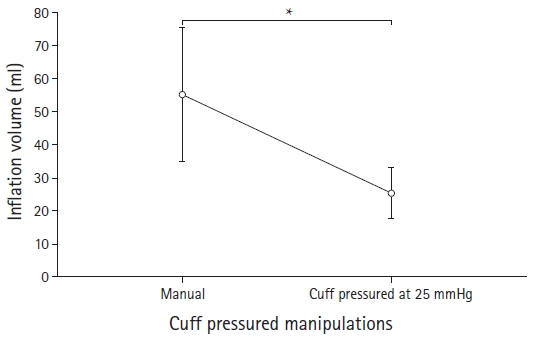
The next example includes virtual data on the required air volume to ensure endotracheal cuff sealing during general anesthesia (Supplementary material 3; cuff_pressure.csv). After tracheal intubation with an adequately sized tube, cuff sealing was achieved through either an arbitrary volume that prevented end-inspiratory leak or by a volume resulting in a cuff pressure of 25 mmHg. The two alternative volumes necessary for the two cuff sealing methods were measured for each patient, and a total of 100 patients were included. A paired t-test was performed because the two methods were conducted on each patient. The results are presented in Table 2. Fig. 3 shows a graphical representation of the results (Supplementary material 1; R code).
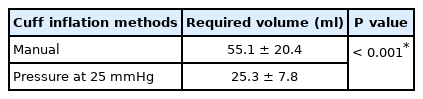
Cuff Inflation Volume to Prevent End-inspiratory Gas Leakage
Comparisons between more than three independent groups
For the following example, information on the amount of opioids administered for pain control after three types of surgery were obtained (Supplementary material 4; opioid_surgery.csv). The total number of patients was 171 (57 in each group).
One-way analysis of variance (ANOVA) was performed, and there was a statistically significant difference in the opioid dose administered according to the surgery type. Tukey’s test was performed for post-hoc testing. The results showed that the opioid dose administered after operation C was significantly higher than that administered after operations A or B (Table 3).
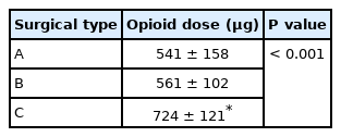
Postoperative Opioid Requirements according to Three Different Types of Surgery
A graph of the statistical results is shown in Fig. 8. As the three groups were not related to each other, they are expressed as bar graphs. The results of the statistical tests are presented in the Supplementary material 1; R code.

An example of a vertical bar plot. The asterisk (*) is used to represent a comparative statistically significant result.
Comparisons for repeatedly measured data
In the following example, virtual data on the effect of an antihypertensive drug on diastolic blood pressure were used (Supplementary material 5; dbpmedication.csv). A total of 114 patients were included, and the control and treatment groups were equally allocated. Data were measured six times at 5-second intervals, including the time of drug administration. For statistical analysis, two-way mixed ANOVA with one within-factor and one between-factor was used. There was a statistically significant difference between the treatment and control groups (F[1,112] = 6.542, P = 0.012), and there was a statistically significant interaction between the treatment and the time (F[3, 336.4] = 3.535, P = 0.015). The treatment group showed significant differences at 15, 20, and 25 s after administration (adjusted P = 0.004, P = 0.003, and P = 0.006, respectively; Table 4). The detailed statistical analysis process was omitted, but a graph of the results is shown in Fig. 2. The graphs are slightly shifted to the left and right so that they can be distinguished from each other, and a gap is set on the y-axis. These methods make the results easier to visualize by preventing the graphs from overlapping and reducing the whitespace (Supplementary material 1; R code).
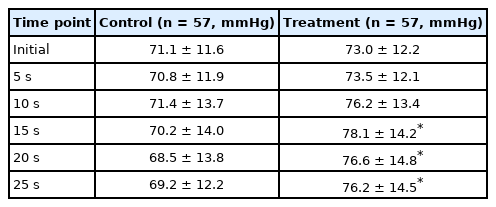
Changes in Diastolic Blood Pressure after Antihypertensive Treatment
Categorical data comparisons
For the following example, two categorical variables (endotracheal intubation success and sore throat occurrence) were assessed in relation to two different intubation techniques (Supplementary material 6; sorethr.csv). The data included two observations from 106 patients (53 patients in each group). The chi-square test with Yate’s correction showed that the success rate of the new tracheal intubation technique was significantly higher than that of the conventional technique (P = 0.018), whereas there was no statistical difference in sore throat occurrence (Table 5). The results are represented using a bar graph classified by observation (Fig. 9). Because the 95% CIs are not symmetrically distributed with respect to the representative values, both error bars are presented and statistical significance is indicated using symbols. To better represent the data, the sample size may also be displayed (Supplementary material 1; R code).
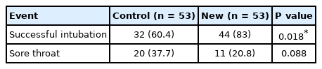
Observed Intubation Success and Presence of Sore Throat after the Conventional and New Intubation Technique

An example of a grouped bar plot. The height of each bar indicates the observed rate. If the CIs of the rate are not distributed symmetrically from the observed rate, both sides of the error bar should be presented. The asterisk indicates statistical significance.
Other commonly used statistical graphs
Correlation analyses, linear regression
As an example of correlation analysis, the blood concentrations of three intravenous anesthetic adjuvants were measured during propofol general anesthesia (Supplementary material 7; pretxlevel.csv). All three adjuvants (A, B, and C) showed a positive correlation with exposure time (correlation coefficient r = 0.71, r = 0.65, and r = 0.42, respectively), but only the coefficient of adjuvant A was statistically significant (P = 0.014, P = 0.117, and P = 0.132, respectively; Fig. 10). Various diagrams can be used to show these correlations. However, in this article, a scatter plot with a trend line for the group, and the statistical analysis results are presented (Supplementary material 1; R code).
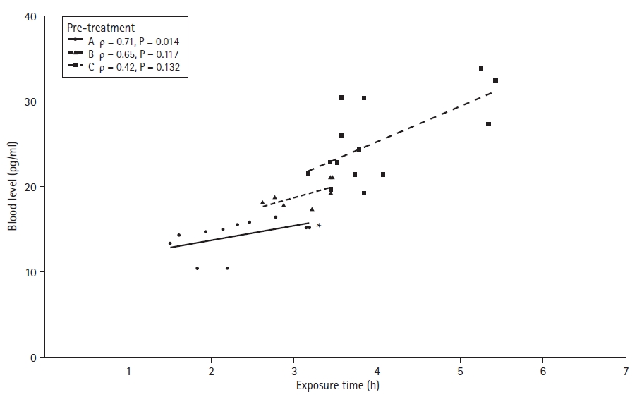
An example of a scatter plot with a linear trend line for the correlation analysis. The asterisk indicates statistical significance.
A scatter plot with a trend line clearly represents the data and is used more often in linear regression analyses than in correlation analyses. For the linear regression example graph, blood glucose concentrations and the degree of glucose deposition in the mitral valve node were used in patients with type 2 diabetes with rheumatic mitral valve insufficiency (Supplementary material 8; dmmvi.csv). Linear regression analysis was performed with blood glucose concentration as the independent variable and the degree of glucose deposition in the mitral valve as the dependent variable. The regression equation was estimated to be “Glucose in nodule = 0.048 × Blood glucose concentration + 32.98 (P < 0.001)”. The graph in Fig. 11 shows the observed values with a regression line and other necessary information (Supplementary R code).

An example of a scatter plot with a trend line for the linear regression. Around the regression line, the shadowed area indicates the range of the 95% CI of the estimated coefficient. The estimated regression line formula is also presented in the graph with statistics.
Logistic regression
For the following example, virtual data showed the influence of five factors on specific test results (Supplementary material 9; five_factors.csv). The test result is a yes/no dichotomous variable, whereas all five factors (F1 to F5) are continuous variables. Although logistic regression analyses involve various assumptions that must be verified before statistical analysis to obtain accurate results, the contents of such verification processes have been omitted. The model estimated by logistic regression provides the odds ratio (OR) for each independent variable (Table 6). A graphic representation of ORs allows for a clearer interpretation than a table in the case of multiple independent variables or ORs with many numbers (Fig. 12, Supplementary material 1; R code).
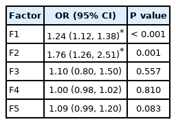
Estimated OR and 95% CI of Logistic Regression Model
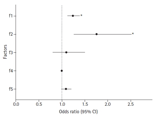
An example of a dot plot with an error bar. For each level of factors (y-axis), corresponding odds ratio (OR) and 95% CIs are presented using dots and accompanying horizontal error bar. The dotted line indicates the reference value of 1. The estimated OR would not be different from 1.0 statistically if its error bar crossed this reference line.
Survival analysis
Survival analysis is a statistical method that can be applied to mortality data and various types of longitudinal data. There are various methods, from the nonparametric Kaplan-Meier method to more complex methods involving different parametric models. Kaplan-Meier survival analysis and Cox regression models are widely used in the medical field. Survival analysis results usually accompany the survival curve, which can increase the reader’s understanding of the results through visualization. For details on the survival curve, refer to the previous Statistical Round article [5,6]. An example of a survival curve is shown in Fig. 13. In addition to several important pieces of information that should be included, the survival table must be attached to the survival curve because the number at risk is reduced at the end of the observation. This can minimize the likelihood of misinterpretation.

An example of a survival curve. Two survival curves with 95% CIs are presented. The median survival time is also indicated for each curve. Because the number at risk decreases at the end of observation, the survival table should be incorporated with curves to clarify the statistical inference process. From the previously-published article: "In J, Lee DK. Survival analysis: part II - applied clinical data analysis. Korean J Anesthesiol 2019; 72: 441-57."
Dose-response curve
For this example, various concentrations of two antibiotics were assessed by measuring the absorbance of a specific light known to be proportional to the normal bacterial flora amount in a culture medium (Supplementary material 10; antiobsorp.csv). The data were fitted using a 4-parameter log-logistic model; the estimated parameters are summarized in Table 7. A graph of the fitted model is presented in Fig. 14 (Supplementary material 1; R code). The absorbance values for the doses of the two antibiotics are expressed using symbols, and a dose-response curve was drawn. Compared to a table that includes only numbers, using a graph is more intuitive and easier to interpret.
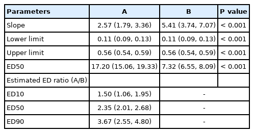
Dose-response Curve Model Fit Result
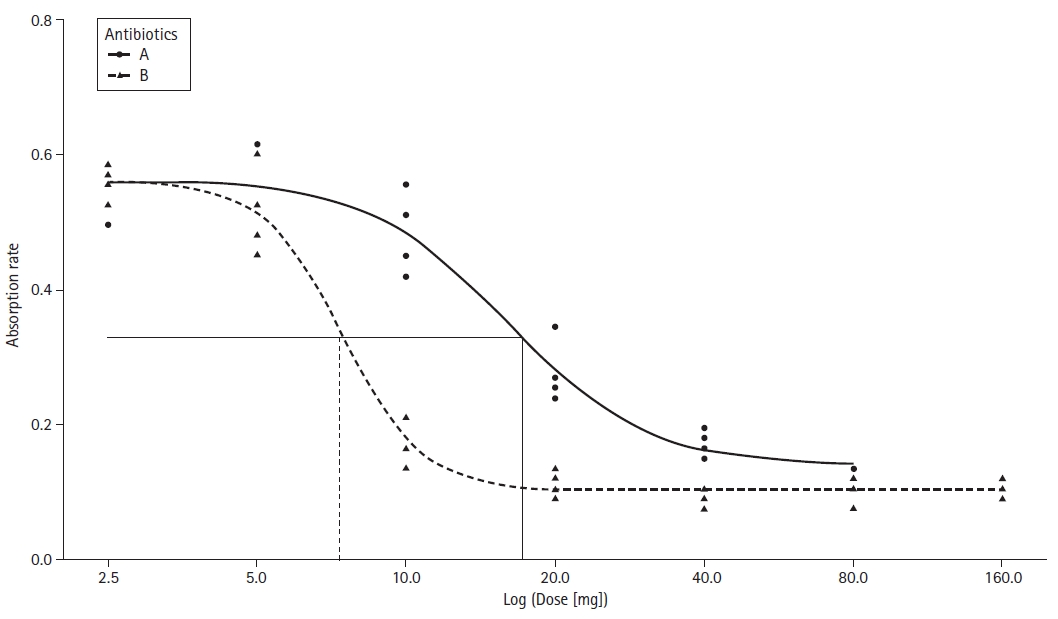
An example of multiple dose-response curves. Observed values are plotted using dot symbols: filled circles and triangles. The straight solid and dashed lines indicate the ED50 value of each curve. Be aware that the x-axis is log scaled.
Conclusions
There are many types of graphs for various statistical methods that can be used to represent data and results, depending on their characteristics. Trying out a few types of graphs that show the characteristics well and then choosing the best one among them is recommended. Presenting results with a table and a figure simultaneously takes up space and can distract readers. Therefore, it is recommended to use graphs and discuss significant results in the body of the manuscript, and tables of granular information can be moved to the supplementary material or vice versa.
Notes
In addition to a two-dimensional graph consisting of a horizontal (x-axis) and a vertical axis (y-axis), a three-dimensional graph using a third axis (z-axis) perpendicular to both axes is also widely used in specific fields. In this article, we will focus on two-dimensional graphs.
The trend line is a type of regression graph that provides useful information regarding the relationship between two variables and can be fitted as linear, quadratic, or cubic formulas.
When the range of error has both positive and negative values, like a continuous variable, the histogram contains the possibility of error in a strict sense. This is because, when expressed as a bar graph, the error range on one side does not appear on the graph (as shown in Fig. 7). While there is a way to express both sides when the range of error is different, it is not commonly used. In most medical papers, they are used without distinction given the general perception that the error range expressed in the bar graph is naturally distributed equally on both sides.
Notes
Funding
None.
Conflicts of Interest
No potential conflict of interest relevant to this article was reported.
Author Contributions
Jae Hong Park (Conceptualization; Methodology; Validation; Writing – review & editing)
Dong Kyu Lee (Data curation; Formal analysis; Methodology; Supervision; Validation; Writing – original draft; Writing – review & editing)
Hyun Kang (Conceptualization; Data curation; Writing – review & editing)
Jong Hae Kim (Conceptualization; Data curation; Writing – review & editing)
Francis Sahngun Nahm (Conceptualization; Data curation; Writing – review & editing)
EunJin Ahn (Conceptualization; Data curation; Writing – review & editing)
Junyong In (Conceptualization; Data curation; Validation; Writing – review & editing)
Sang Gyu Kwak (Conceptualization; Data curation; Writing – review & editing)
Chi-Yeon Lim (Conceptualization; Data curation; Writing – review & editing)
Supplementary Materials
R code
reverse
cuff pressure
opioid_surgery
dbpmedication
sorethr
pretxlevel
dmmvi
five factors
antiobsorp